Weddings on your terms
Written by : Jodie Garneau
If you’ve been seeing citron and chartreuse everywhere lately… you’re not imagining it. From fashion runways to Pantone predictions to wedding TikTok, yellow is back — but not the highlighter, sunflower-in-every-vase kind. We’re talking citrus-forward. Sophisticated. Editorial.
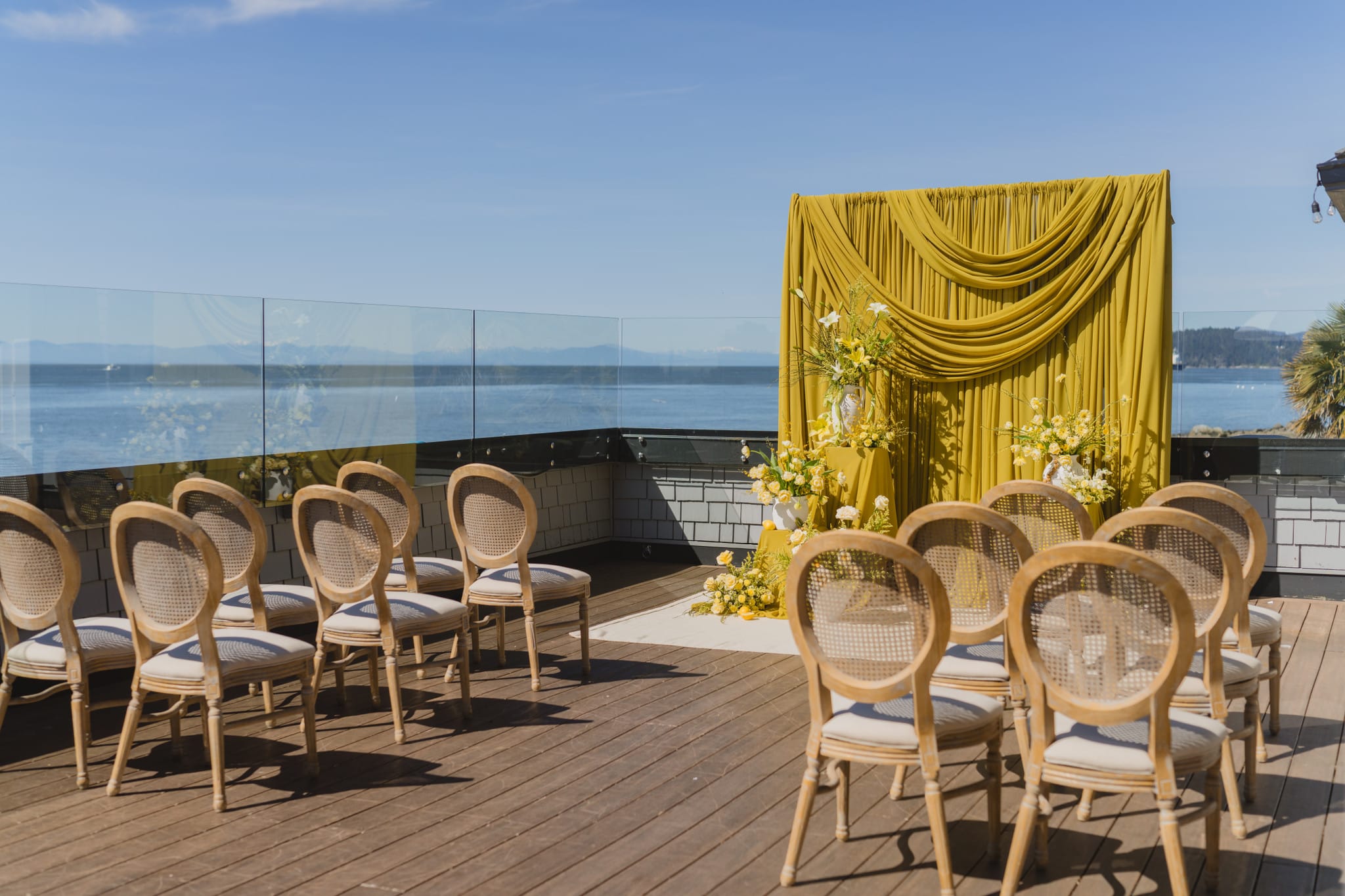
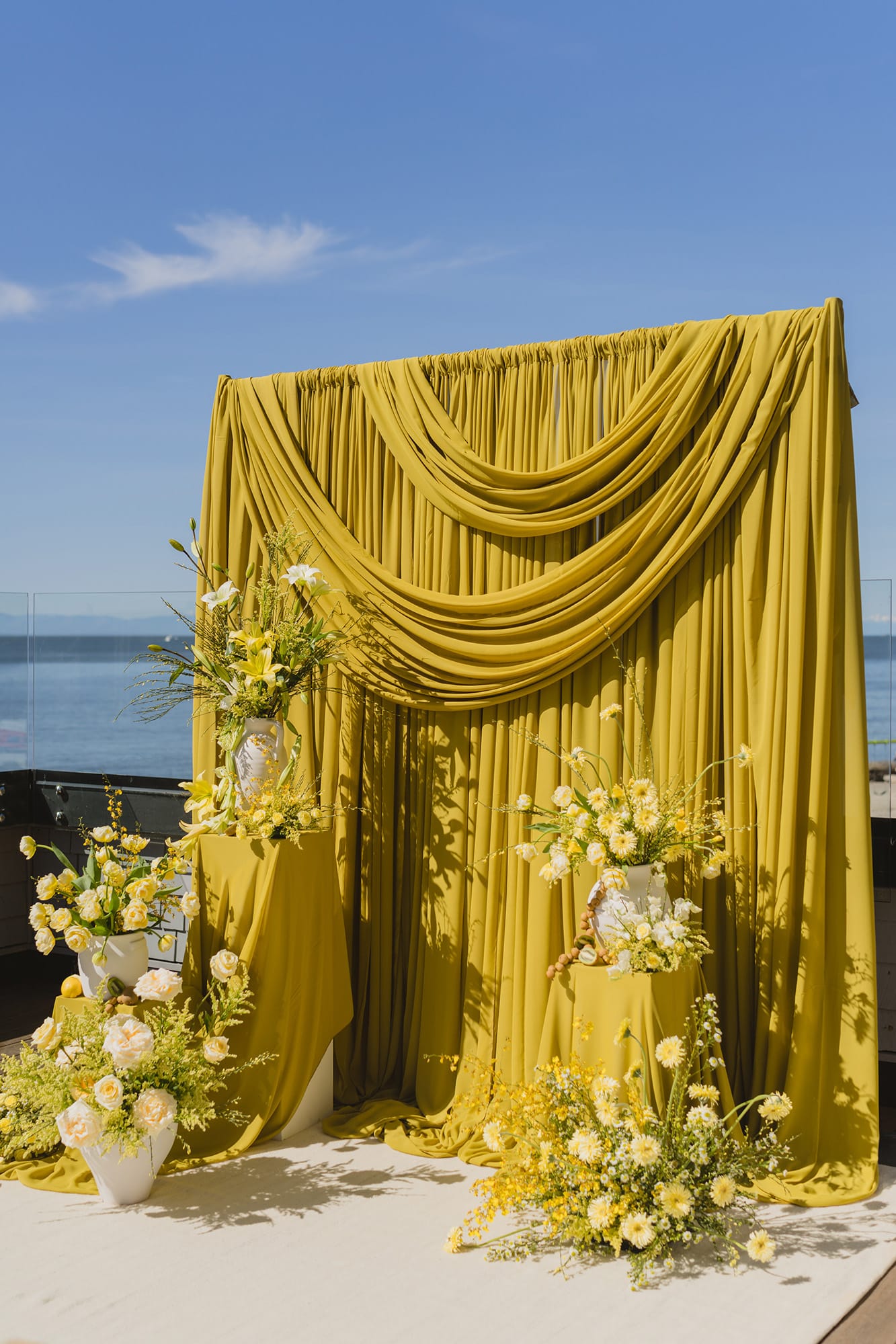
And if you caught our Glowing Vancouver Wedding Inspo with Citrus-Hued Blooms featured in Rocky Mountain Bride then you already know: this isn’t just a trend we’re watching. It’s one we designed — and just won Best Styled Creative Shoot (2025) at the WPIC awards for.
Let’s talk about why citron and chartreuse are quietly becoming the colour story of 2026 weddings — and how to use them without making your wedding look like a lemon stand.
Need Help Planning Your Yellow Wedding? Work With Thistle & Thorne Wedding Planners!
TABLE OF CONTENTS
- Key Takeaways
- Citron and chartreuse are leading the 2026 yellow wedding theme conversation.
- Yellow works best when layered with texture, draping, and intentional contrast.
- A yellow and green wedding theme feels elevated when chartreuse is the anchor.
- Editorial-inspired weddings are driving colour trends more than tradition.
- Working with an experienced Wedding Planner ensures bold colour choices feel refined, not chaotic.
- Why Yellow Works for Weddings in 2026
- Picking the Right Shade of Yellow
- Yellow for the Right Skin Tone
- Seasonal and Destination Tips
- Yellow Bridesmaid Dresses: Inspiration
- Yellow Wedding Decor Ideas
Key Takeaways
Citron and chartreuse are leading the 2026 yellow wedding theme conversation.
Yellow works best when layered with texture, draping, and intentional contrast.
A yellow and green wedding theme feels elevated when chartreuse is the anchor.
Editorial-inspired weddings are driving colour trends more than tradition.
Working with an experienced Wedding Planner ensures bold colour choices feel refined, not chaotic.
Why Yellow Works for Weddings in 2026
Let’s clarify something.
Moody palettes had their heyday in the early 2000s. Deep plums. Chocolate browns. Dramatic contrast. That era had its moment. But the trend we’re actually stepping out of right now? Pastels. Neutrals. Dusty mauves. Muted sage. Beige-on-beige-on-beige.
For the past several years, weddings have lived in soft, desaturated territory. Light tones. Whispery palettes. Safe colour choices. And now? Couples are ready to feel something again.
Citron and chartreuse represent a shift toward intentional boldness. Not chaotic colour. Not rainbow maximalism. Just confident, considered saturation. These tones still feel refined — but they carry energy. They photograph with depth. They create dimension in spaces that might otherwise feel washed out.
At the same time, yellow continues to resonate because of what it communicates emotionally. It feels optimistic, calm, and grounded — exactly the kind of atmosphere many couples want to create. Not loud for the sake of it, but expressive in a way that still feels easy and livable. A well-designed yellow palette doesn’t overwhelm a space, it softens it. It creates flow. Guests feel comfortable, relaxed, and connected to what’s happening around them, especially in outdoor settings, garden weddings, and light-filled venues.
We’re seeing couples move from “What’s the safest palette?” to “What colour story actually feels like us?”
That’s why yellow works in 2026. It’s not nostalgia. It’s not retro. It’s bold — but controlled. Optimistic — but elevated. And when layered properly, it feels editorial instead of trendy.
1. Butter Yellow Wedding Theme (The Softer Sister)
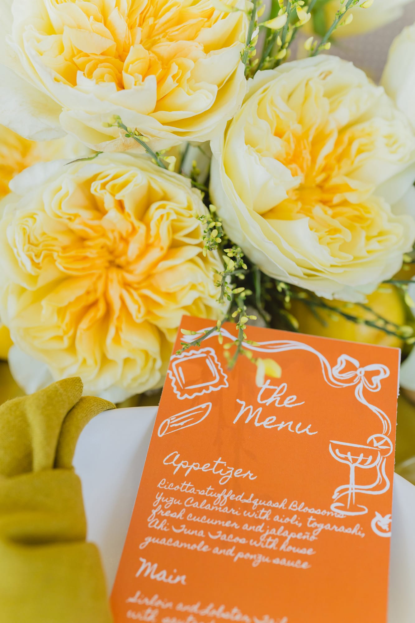
If citron feels too bold, butter yellow still works in 2026 — but it needs layering.
Think:
- Tonal florals
- Texture over contrast
- Minimal greenery
- Sculptural candles
- Butter yellow on its own can feel flat. But when layered properly, it becomes romantic and luminous.
2. Pastel Yellow Wedding Theme
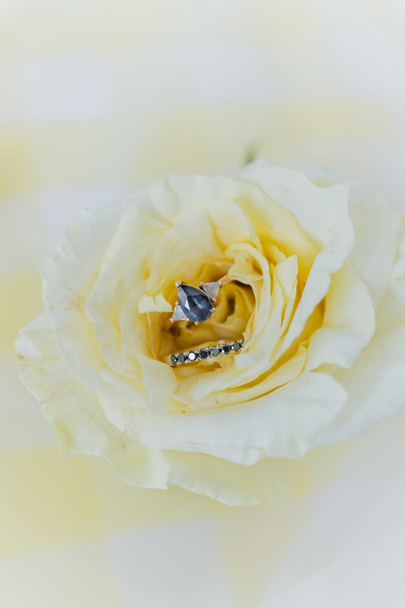
Pastel yellow leans whimsical — which works beautifully for garden weddings and spring celebrations.
To modernize it:
- Keep your florals tight and intentional.
- Avoid too many competing pastel colours.
- Add a structured design element (clean table lines, modern chairs, architectural ceremony setup).
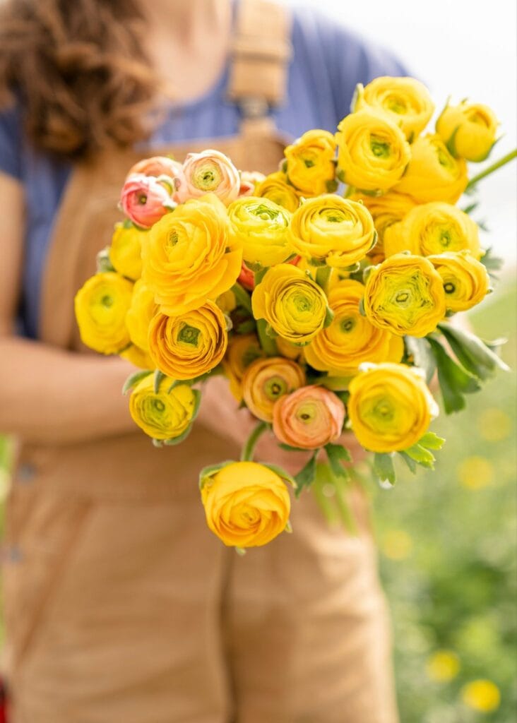
Legal: unsplash license
3. Yellow and Green Wedding Theme
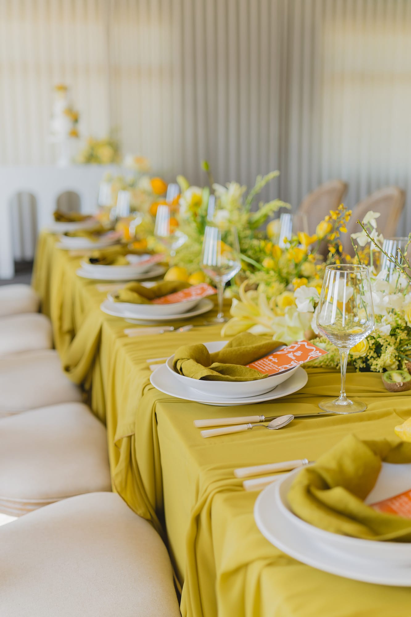
This is where 2026 lives.
Not sage and sunflower. Not rustic barn. But Chartreuse. Citron. Olive. Soft cream. Layered intentionally.
Green tones prevent yellow from overwhelming the space. They create depth and keep the palette feeling grounded.
This combination works especially well in:
- Botanical venues
- Outdoor coastal spaces
- Modern indoor venues with strong natural light
4. Sunshine Yellow Wedding Theme (Used Strategically)
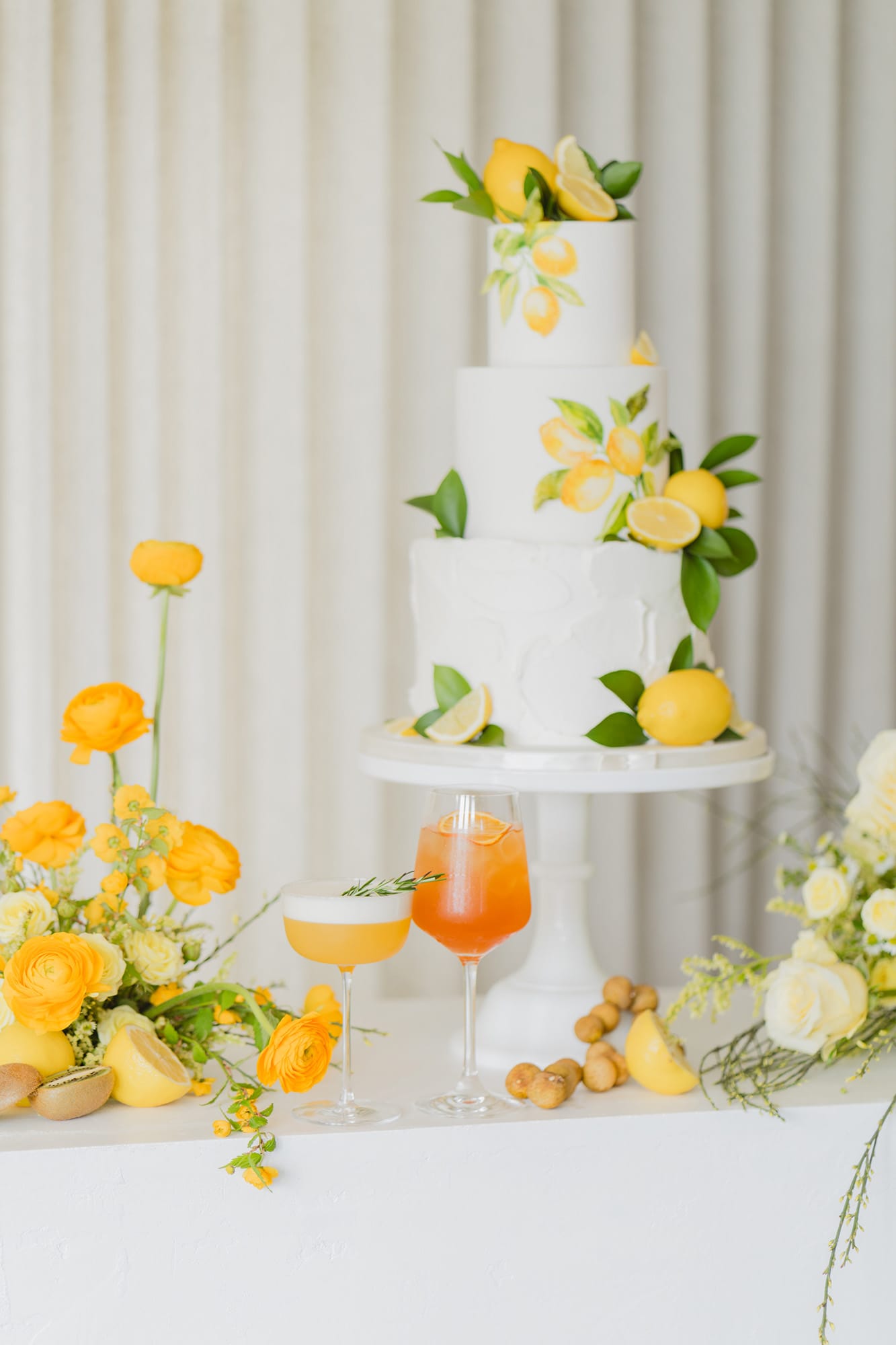
Bright sunshine yellow isn’t out — it just needs discipline, Not as the entire palette.
Use it as:
- Floral accents
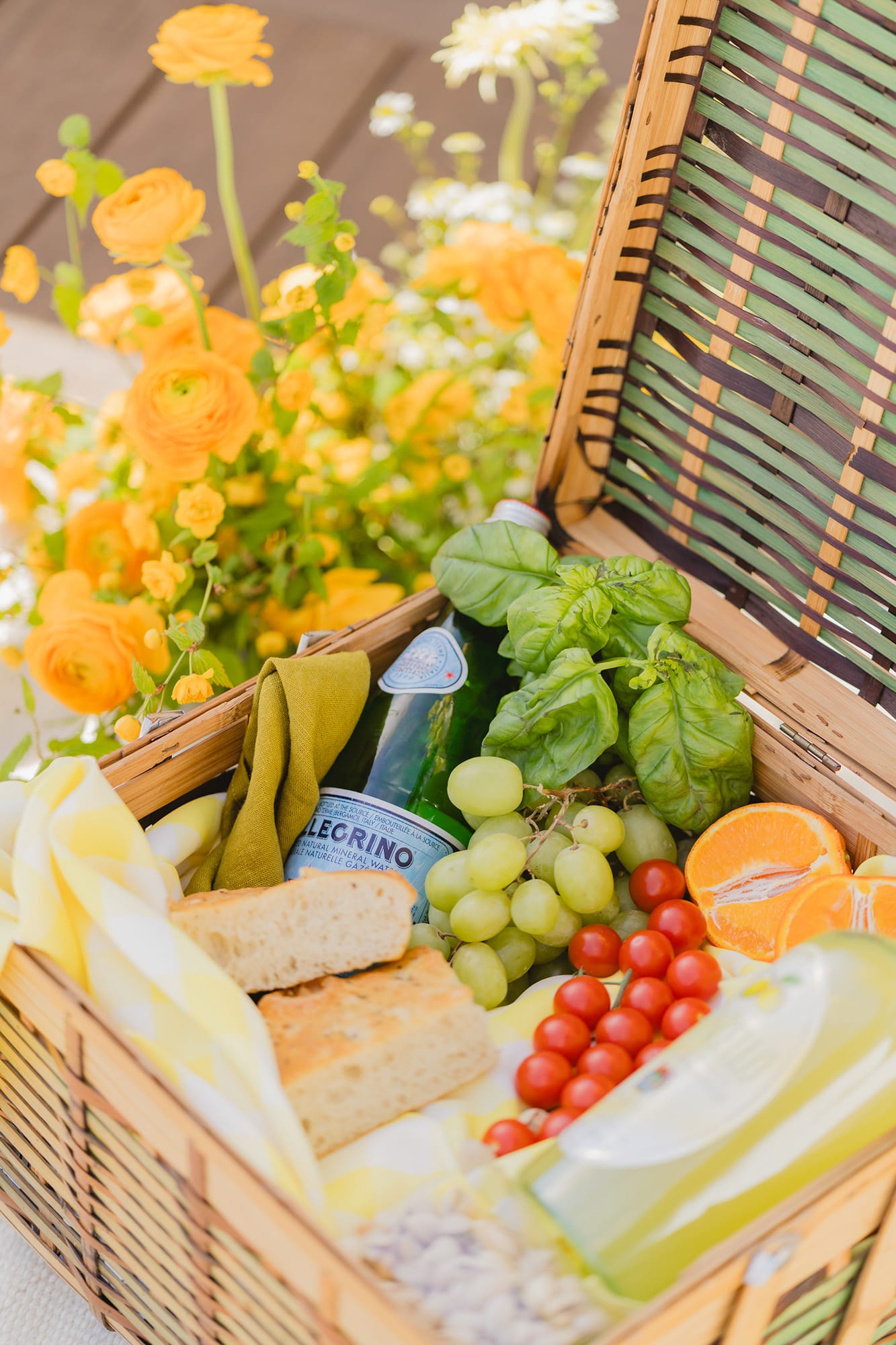
- Fruit styling
- Cocktail details
- Cake accents
5. Lemon Yellow Wedding Theme
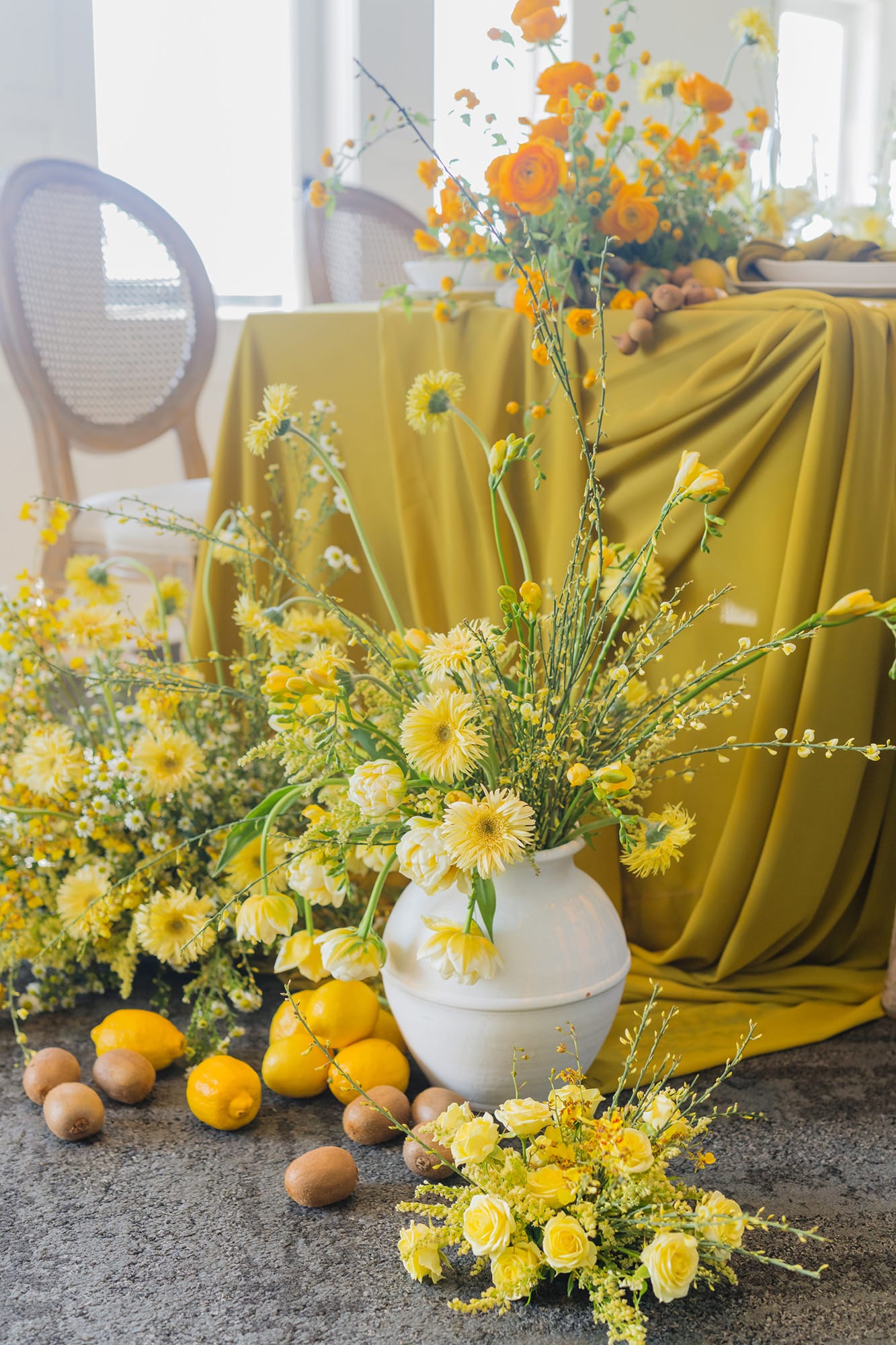
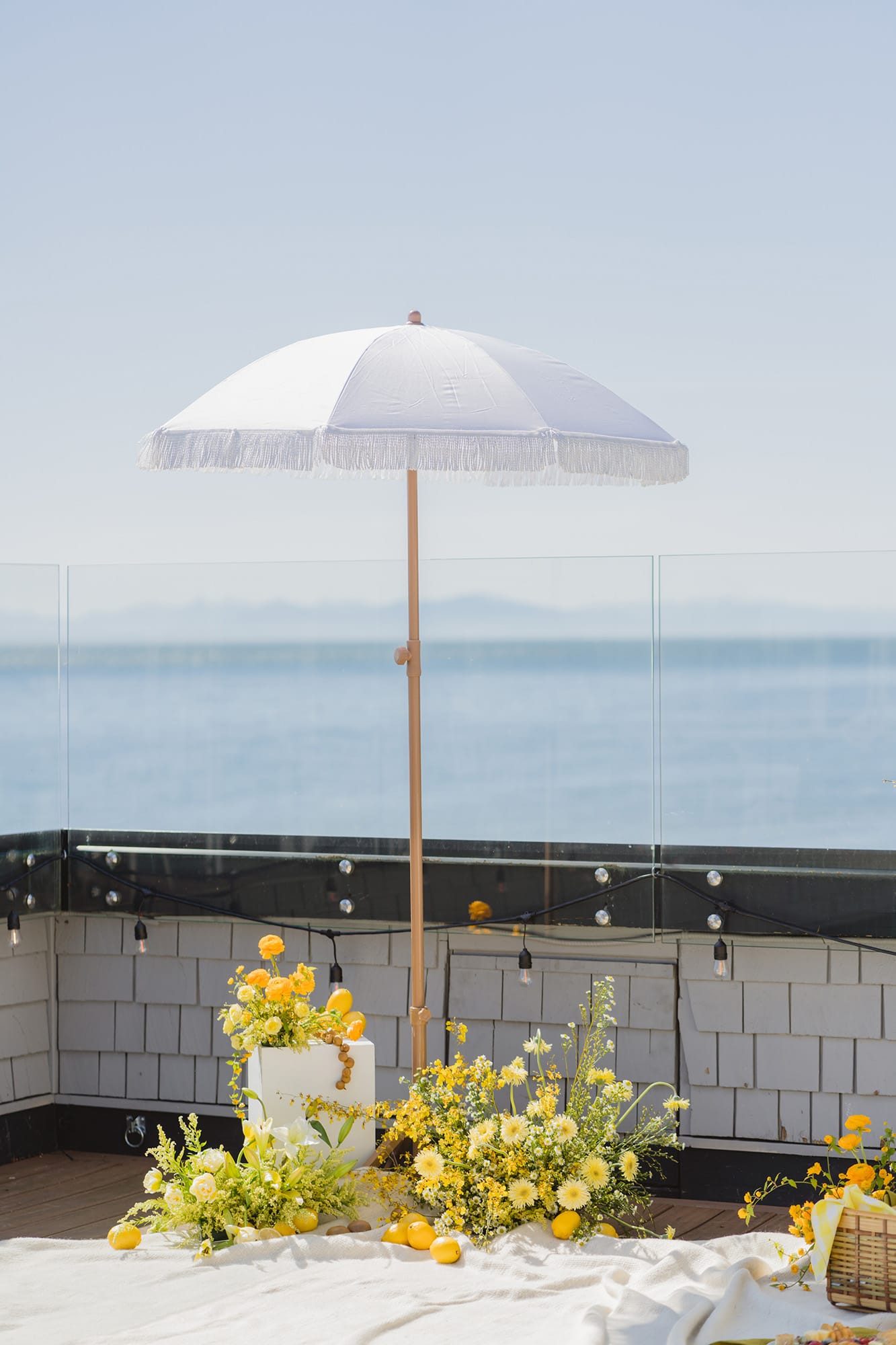
A citrus-forward wedding theme works beautifully when yellow is treated as an accent.
Think:
- Lemons integrated into centrepieces
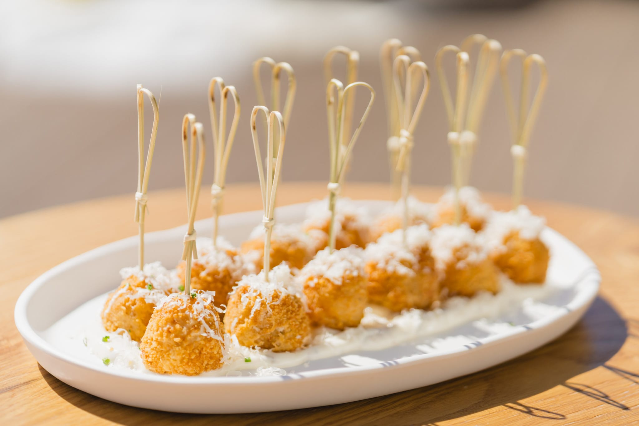
- Citrus cocktails at cocktail hour
- Fruit woven into floral installations
- Hand-painted cake details
This feels playful — but elevated.
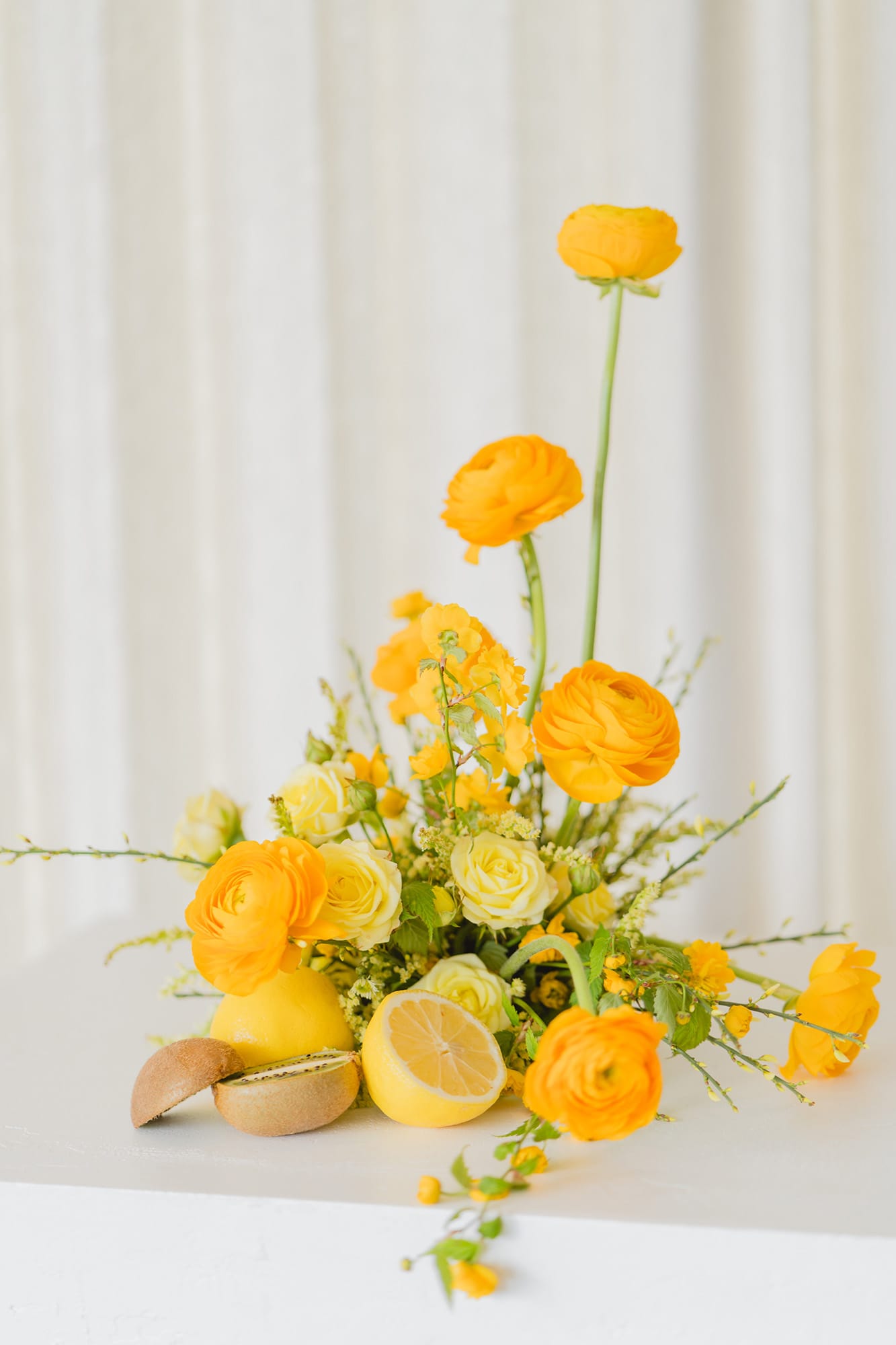
6. Editorial Yellow Wedding Design
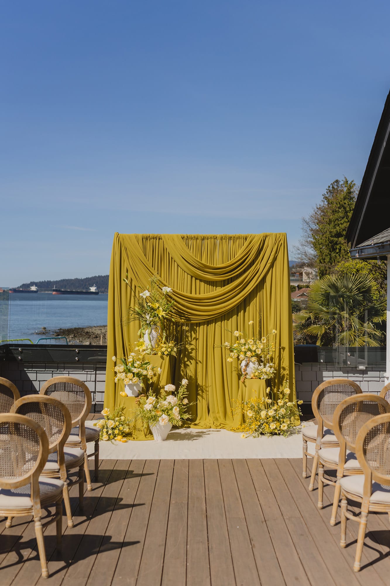
If you’re drawn to what you’re seeing online labelled as “colour of the year” — you’re noticing something real.
Trend authorities across fashion and interiors have spotlighted yellow-green tones as emerging statement colours for 2025–2026. You’ll see citron and chartreuse referenced in runway collections, interior forecasts, and wedding trend roundups alike.
The key difference?
Editorial design leads. Pinterest follows.
Our approach with Thistle & Thorne is never to chase colour trends. It’s to interpret them through thoughtful, layered design.
That’s how yellow becomes timeless — not trendy.
Picking the Right Shade of Yellow
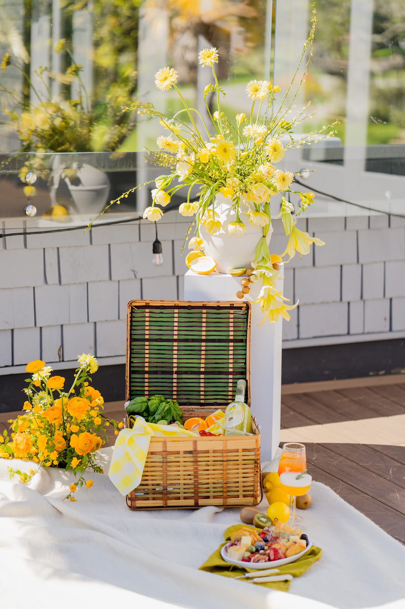
The shade you choose does more than set the mood — it interacts with everything around it. Venue lighting. Skin tones. Fabric texture. Floral selection. Photography style. It’s the difference between a palette that feels intentional and one that falls flat.
Yellow, especially, responds to its environment in very specific ways. Walls, flooring, and floral backdrops all play a role in how it reads — whether it feels soft and atmospheric or sharp and overpowering. The goal isn’t just choosing a colour, it’s placing it correctly. Think shaded garden corners, sun-drenched terraces, or against darker architectural elements where the tone can hold its depth without overwhelming the frame.
Quick yellow tone guide:
- Soft buttery tones glow in diffused light.
- Chartreuse thrives in bright, natural light.
- Bold citron can look electric in direct sun — so balance with neutrals.
- A yellow and green wedding theme benefits from depth variation.
Yellow for the Right Skin Tone
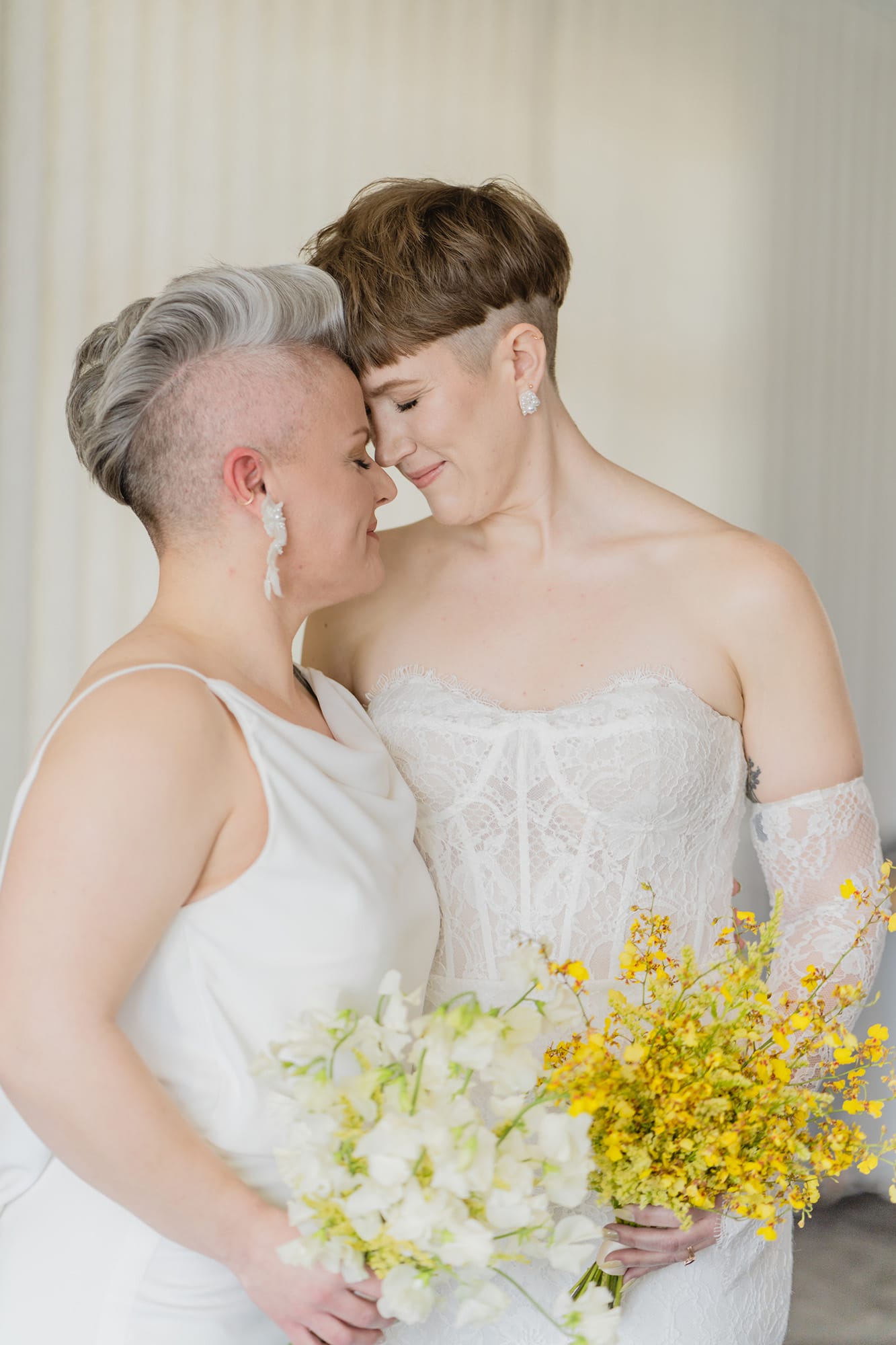
Not every yellow flatters every skin tone — but the right shade makes all the difference. Colour should enhance you, not compete with you.
Yellow Skin Tone Guide:
- Fair to medium skin tones often glow in soft butter and pastel yellow.
- Medium to deeper skin tones shine in golden, marigold, and rich citron.
- Mixing tonal variations across your wedding party is often the most inclusive (and visually interesting) solution.
Seasonal and Destination Tips
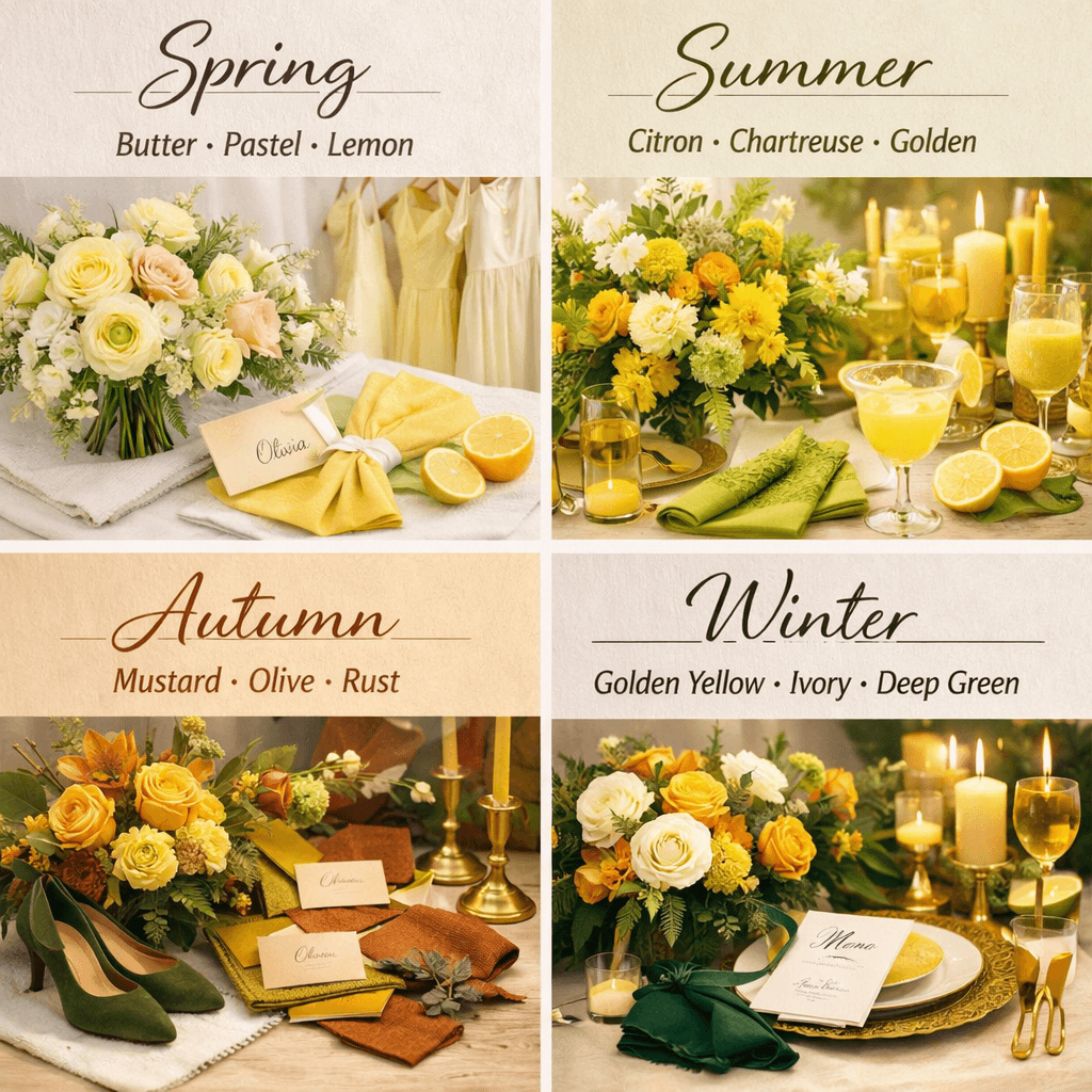
Colour doesn’t exist in a vacuum — it shifts with the seasons, taking on different depth, light, and energy depending on when your wedding takes place.
What feels soft and airy in spring can read flat in winter. What feels bold and vibrant in summer might feel out of place in autumn. The key is working with the season, not against it.
Think of your palette as a reflection of the environment around you — the light, the landscape, the overall mood. When your colours align with the season, everything feels more cohesive, more elevated, and far more effortless.
Spring Weddings
- Shades: Soft pastel yellow, butter, or lemon tones.
- Why it works: These colors complement the fresh greenery and blooms of spring, creating a romantic, airy feel.
- Lighting & Photography: Soft natural light enhances pastel yellows, making bouquets and décor appear luminous and delicate.
- Tips: Pair with blush, soft grey, or light green to keep your palette gentle and elegant.
Summer Weddings
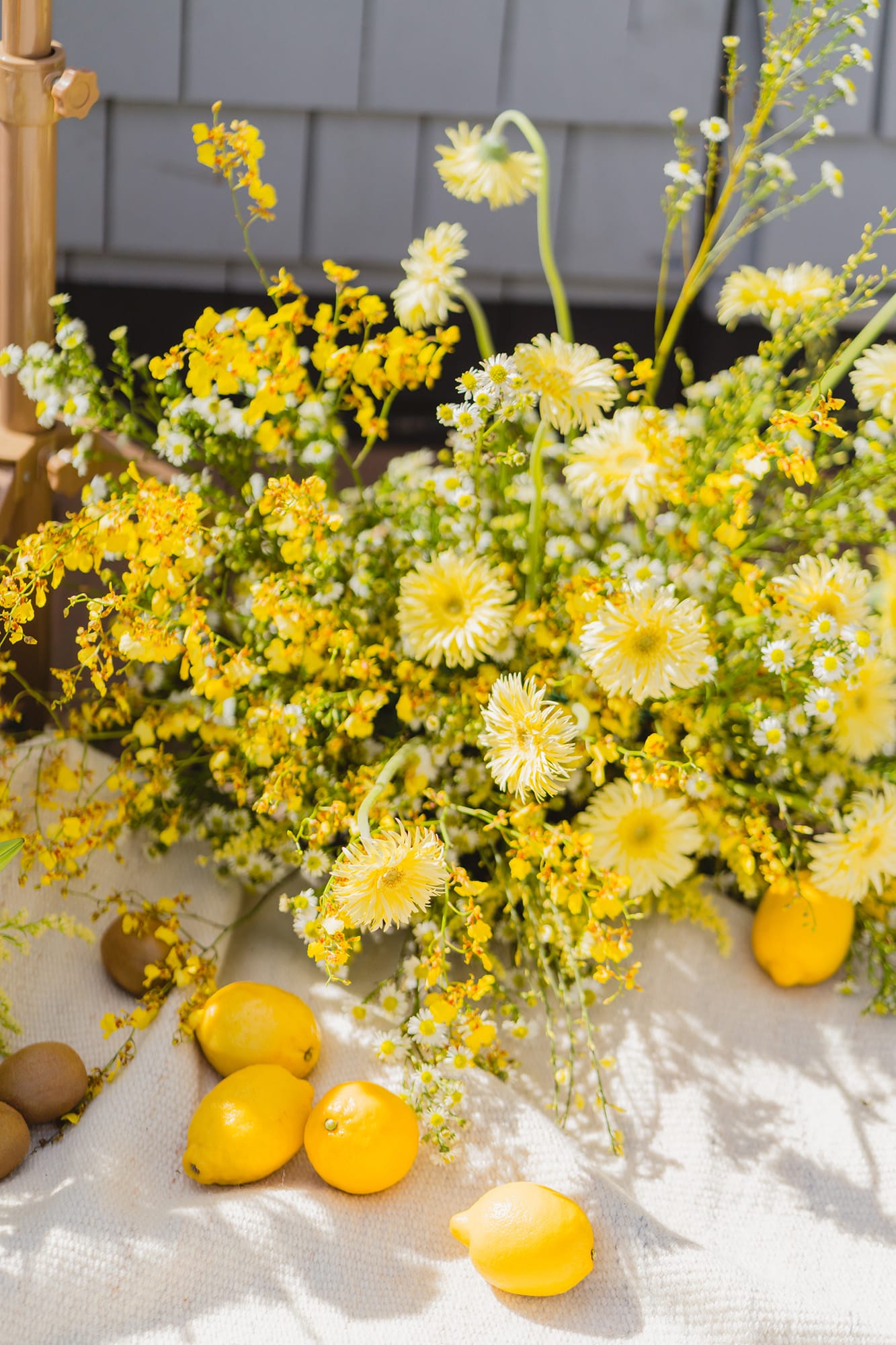
- Shades: Bright yellows like sunshine, daffodil, or gold.
- Why it works: Bold yellows match the energy of summer, making your wedding feel vibrant and joyful.
- Lighting & Photography: Direct sunlight can intensify bright yellows—use shaded areas for portraits or mix in softer accents to prevent color from looking harsh on camera.
- Tips: Pair with navy, teal, or white to balance the brightness, and incorporate natural elements like sunflowers or citrus for a seasonal touch.
Autumn Weddings
- Shades: Mustard, marigold, and yellow-and-green combinations.
- Why it works: These richer, earthy tones complement autumn foliage and warm interiors.
- Lighting & Photography: Golden-hour light enhances these shades, adding warmth to photos and creating a cozy atmosphere.
- Tips: Pair with rust, burnt orange, deep green, or soft browns for a layered, sophisticated look.
Winter Weddings
- Shades: Golden yellow, mustard, or deeper marigold tones.
- Why it works: Yellow adds warmth and contrast against neutral or muted winter backdrops.
- Lighting & Photography: Indoor lighting may shift yellow tones—consider soft LED or candlelight to preserve warmth.
- Tips: Pair with grey, ivory, or deep jewel tones to keep the palette rich and elegant.
Yellow Bridesmaid Dresses: Inspiration
- Yellow Bridesmaid Dress Inspiration (Kennedy Blue) – Gallery of butter, marigold, mustard, and satin yellow bridesmaid styles across seasons.
- 22 Best Yellow Bridesmaid Dresses (The Knot) – Inspiration from maxi gowns to chiffon silhouettes and statement styles.
- Yellow Bridesmaid Ideas on Pinterest (collection) – Crowdsourced boards with a variety of scenic wedding party dress ideas.
Yellow Wedding Decor Ideas
Yellow can show up in ways that feel layered, intentional, and far from expected. It’s not just about where you use it — it’s how consistently and thoughtfully it carries through the entire experience.
Where it works beautifully:
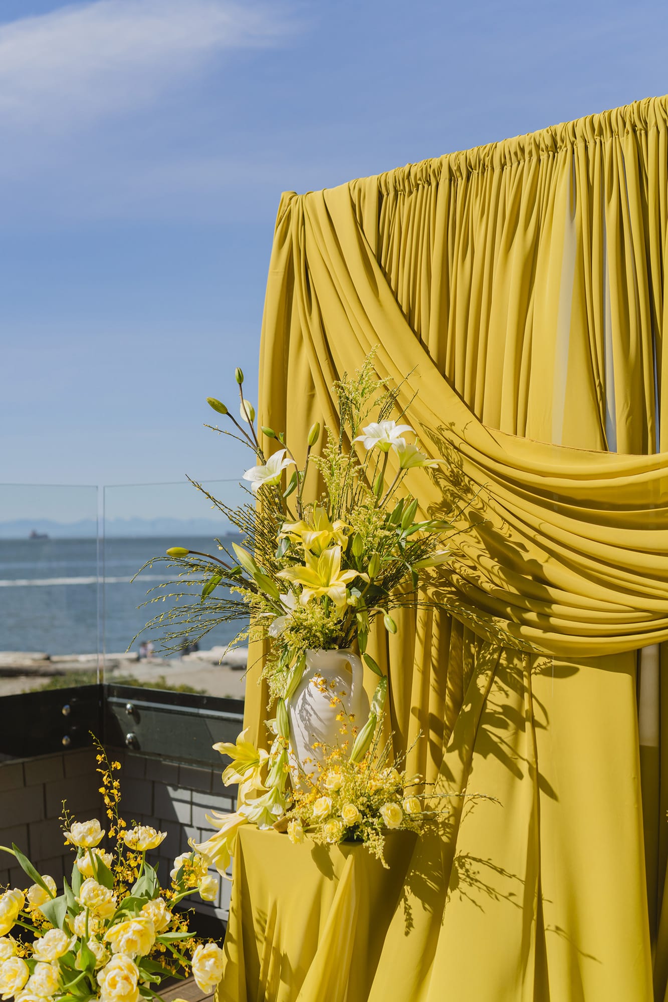
- Draped ceremony backdrops
- Tonal floral installations (bouquets, centrepieces, arches)
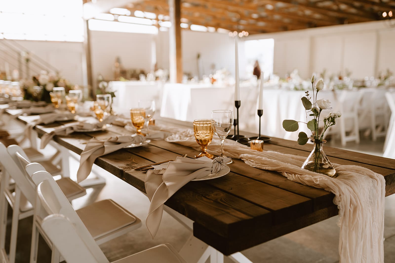
- Statement linens, textured napkins, and layered table settings
- Fruit-integrated centrepieces (lemons, citrus, seasonal elements)
- Signature cocktails and coloured glassware
- Hand-painted cakes or dessert details
- Sculptural bud vase moments
- Bridesmaid dresses, ties, and subtle bridal party accents
- Playful but elevated stationery (menus, signage, programs)
- Small details like ribbon wraps, chair sashes, lanterns, and hanging décor
Especially in outdoor or destination settings, natural elements — like sunflowers, lemons, or golden leaves — make yellow feel organic rather than styled.
The difference between trendy and timeless is always in the restraint.